ShopDreamUp AI ArtDreamUp
Deviation Actions


Description
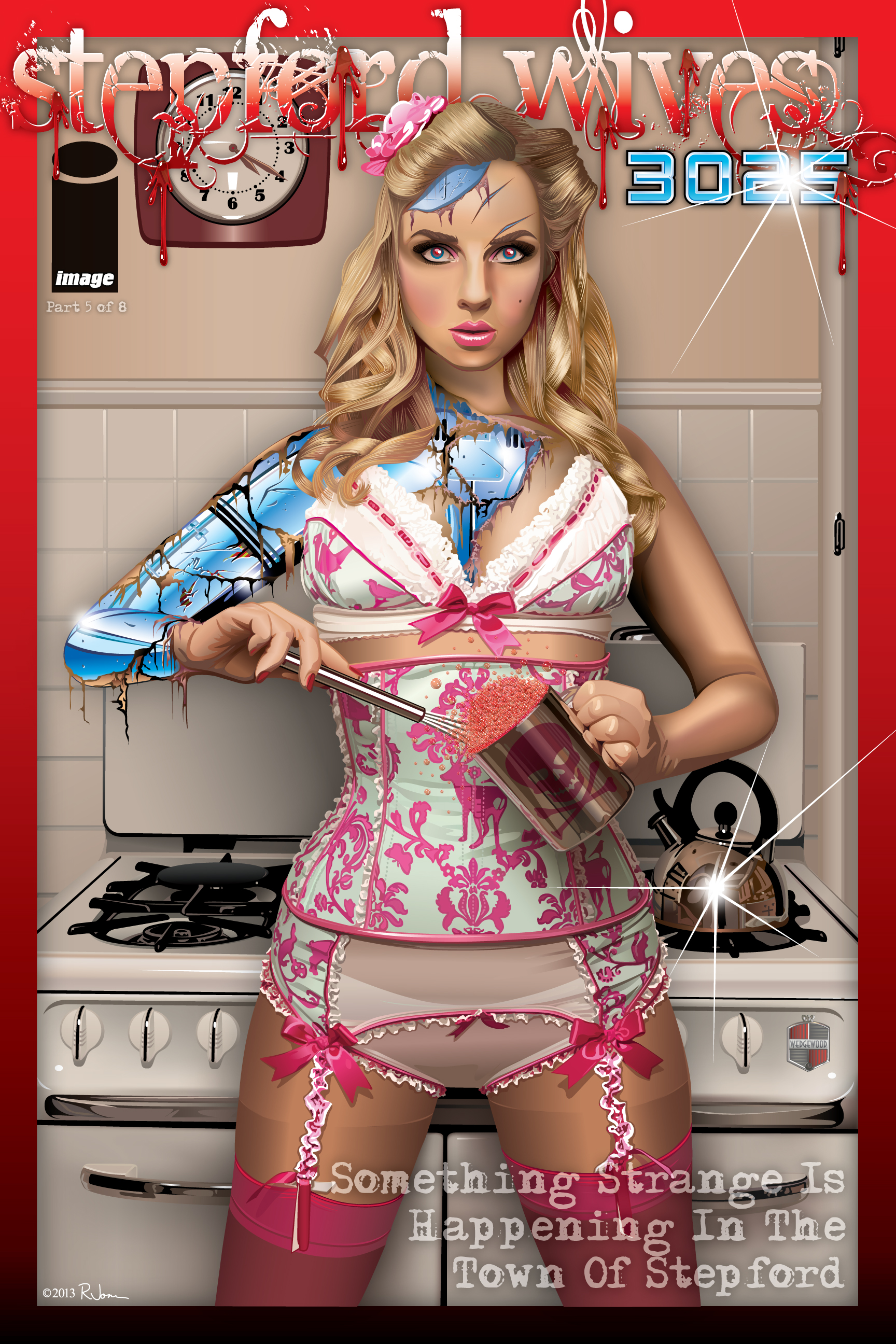
Stepford Wives 3025
My take on the Stepford Wives. This is part 5 of 8, where the action has already started. On a far away planet, human men have recreated their perfect 50's style society. In this issue, Ancilla learns more of the men of Stepford's plans for their perfect town. Unfortunately for them, Ancilla and the other Wives have progressive artificial intelligence, and have figured everything out, including what their own purpose is.
It's now Happy Hour, and Ancilla seems a little, well, pissed.
This is all vector, created in Illustrator.
Model is Ancilla Tilia Image used with permission. Thank You Ancilla!
  (Smile)")
Please let me know what you think.
My take on the Stepford Wives. This is part 5 of 8, where the action has already started. On a far away planet, human men have recreated their perfect 50's style society. In this issue, Ancilla learns more of the men of Stepford's plans for their perfect town. Unfortunately for them, Ancilla and the other Wives have progressive artificial intelligence, and have figured everything out, including what their own purpose is.
It's now Happy Hour, and Ancilla seems a little, well, pissed.
This is all vector, created in Illustrator.
Model is Ancilla Tilia
Image used with permission. Thank You Ancilla! Please let me know what you think.
Image size
1728x2592px 2.4 MB
© 2013 - 2024 rjonesdesign
Comments21
Join the community to add your comment. Already a deviant? Log In
First off, just look at the piece again for a couple minutes and soak up the amount of detail throughout. From the reflective surfaces on the chrome of the stove, to the metallic coffee mug, and all the detail/shading on the lingerie; this has an astounding amount of detail and nuiances that will be missed at just a glance.
As for the execution, you perfectly captured the Stepford Wife-ishness - classic kitchen, sexy model, blank souless stare awaiting instruction... This would make a great Mondo poster for the movie... maybe a drye martini would've been more apropos, but thats nitpicking. Lastly, excellent choice in reference! Ancilla's piece already looked very Stepford Wife-ish, and your reinterpretation of it brought that forth beautifully.
There are only 2 issues I have with the piece. 1. I find the skintone/color to be very dark. And because of that, the shading on the skin is more severe, where as a lighter pallet might have been better. If she would have looked a little softer it could have been a nice juxtapose to her hard flesh melting robotic parts underneath. 2. The bubbles in the cup look fake just because they're too uniform in size. I can imagine layering those wasn't fun, but if you had alternated with different sizes, it might have looked more realistic.
Beyond that, excellent job!